Ruin Your Vision With The Only The Best Illegible Black Metal Band Logos
by Dave Fox
If you are a fan of black metal, or any of its related genres, you must have a special ability to be able to read practically illegible text, because that's what you have to do in order to read the logos of many of these black / doom metal bands.
There's something about black metal band logos that just makes them so engaging. Maybe it's the illegibility, or maybe it's the darkness, but these logos always seem to capture our attention. In this post, we take a look at some of the best black metal band logos around. We've got everything from cryptic symbols to flaming skulls, so read on and see if your favorite logo made the list!
Contents
Top 10 Best Illegible Black Metal Band Logos
Think black metal and most likely the first thing to come to mind is dark, spooky, and overall gothic imagery. From hooded figures draped in capes to runic fonts and crosses emblazoned on album covers, the genre is known for its use of occult symbolism. And let's not forget about those all-important band logos. Often just as visually stimulating (or headache-inducing) as the music itself, black metal logos can be incredibly intricate, blending together elements of classical typography with satanic iconography. With so much creativity on display, it's no wonder that some of these logos are among the most iconic in all of metal. So without further ado, let's start with this…
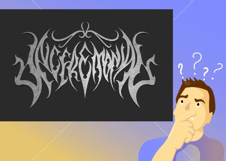
Wolves In The Throne Room Logo (WITTRs Logo)
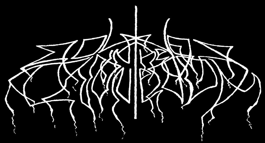
Would you believe it says, Wolves in the Throne Room? Well, it does. Now, what kind of band makes a logo that looks like this?
Not these guys…
Come to think of it, that "Monkees" logo isn't exactly too legible is it? Rather, we're talking about these guys pictured below.
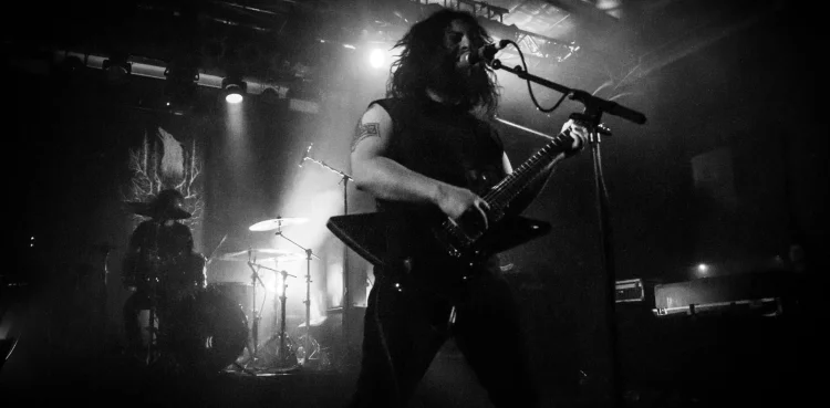
Maybe the fact that the logo looks more like a cult symbol makes a bit more sense now, coming from these guys. Nothing against these guys, or cults…heheeee anyway…
So the topic of this article is to look at various bands with illegible logos and try to figure out just what the h*** is going on.
Nokturnal Mortum Logo
For instance, would you have guessed that the logo below is for a band called "Nokturnal Mortum"?
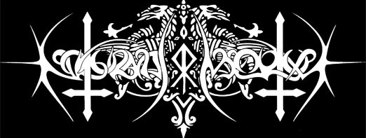
This logo is literally not readable for normal human eyes whatsoever.
But, if you look at it long enough, you can start to make out the words…? kinda…. but compared to some band logos we'll be examining, this is practically block capital letters.
**
In terms of sheer graphical prowess, when it comes to many of these these black metal band logos, there is certainly some sort of font-morphing sorcery at play.
Let's be real: normal fonts are to black metal logo designers are like the Teletubbies showing up when you're trying to saw of a sheep's head with a rusty cleaver. It just ruins the vibe!
Indeed, the best and most effectively un-transcribable black metal band logos have the ability to put a hex on you, while you stand there trying to figure out what you're looking at…until you finally realize that life is not only meaningless, but all life is meaningless and you may as well just jump off the nearest cliff right now, because if you don't, demons are going to sodomize your skull as soon as you fall asleep.
Sink Shower Band Logo
Ehe…Check this one out.
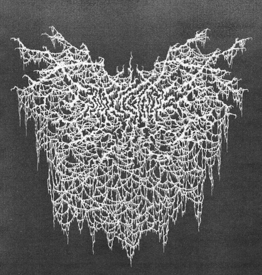
Guess who?
Sink Shower, of course! You know, the ones who brought you such upbeat tracks as Impaling the Impaled.
And to think that logo above is a more restrained version of the same logo that seems to have been redesigned to look like this:
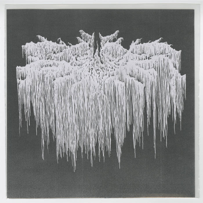
As a fan of black metal, I guess you kind of get used to these bramble-ridden logos, and eventually come to expect it…and finally, DEMAND it, ready to inflict unending pain upon any band or artist that hasn't put that much time into making their logo quite evil-looking enough.
Pretty soon, you just know that when you see a series of illegible white shapes that look like knives, thorns, or webs on a crisp black background, this usually signifies that you are about to be sonically pummelled by a very intense kind of music with an unwavering sense of hatred for you and all mankind.
Take it away, Burzum…
I suppose that came out before someone discovered blast beats, not sure.
If you are a "normal" music listener, you might expect that any band with an illegible black metal logo would probably have music that could be described in some of the following ways: fast, aggressive, angry, often with baffling time signatures, and 7-stringed basses in drop C. And of course, blast beats. Except for Burzum, not sure what their problem is.
Add to that indecipherable, demonic screams or low growling, and then top it off with hate-filled, nihilistic, blasphemous lyrics.
Dimmu Borgir Logo
Take this sampling of lyrics by, from their song Progenies of the Great Apocalypse:
The battle raged on and on
Fuelled by the venom of hatred for man
Consistently, without the eyes to see
By those who revel in sewer equally
We, the prosperity of the future seal
Cloaked by the thunders of the north wind
Born to capture the essence of
The trails of our kind
Zero tolerance must be issued forth
Behind the enemy's line
So it shall be written
And so it shall be done
Who do you think wrote that? That's right, *these guys*…
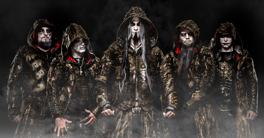
And their logo looks like what…?
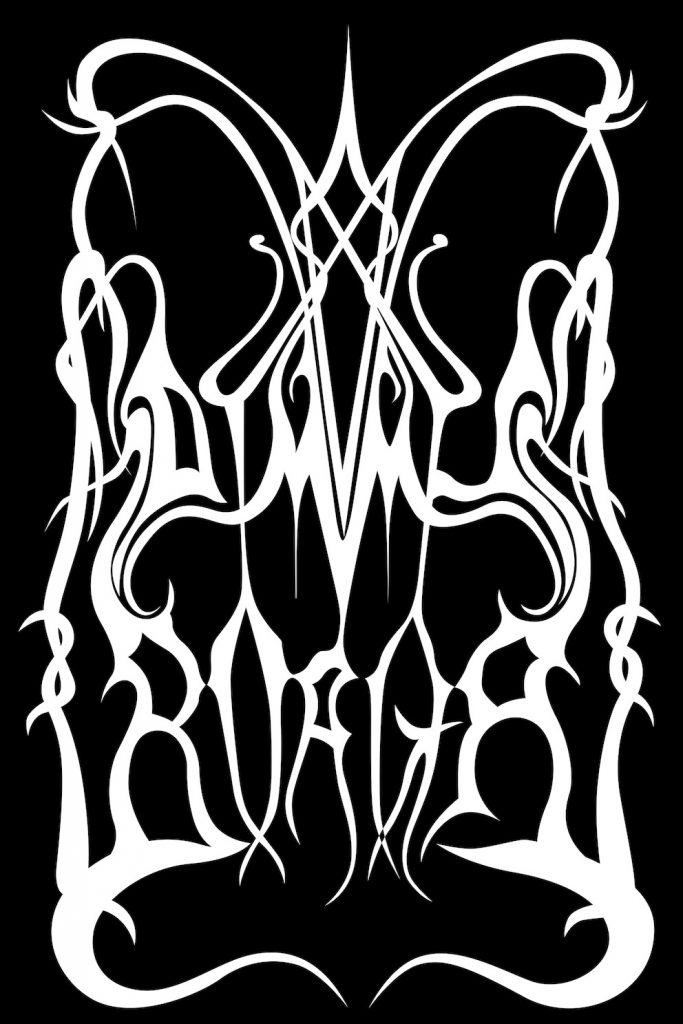
That's right. You might expect some ear-distressing, devil-summoning tri-tones to be in this music, or at least maybe you should. Although, sometimes you may get a sort of early Metallica-esque speed metal riff played, which isn't entirely unwelcome in some circles, depending on your level of doom and gloom.
The vocals, you will find, may also be slightly animalistic. Not so much James Hetfield as it is James Hetfield's corpse if someone were to dig it up 100 years after he dies and sticks a microphone up his bony butt, then adds vocal fry.
So we're back to A Loathing Requiem again. I think this one is slightly newer than the earlier one I shared. To me it says: A Cranial Request. A Clothing Required? This one has a bit of a futuristic twist to it, as if the Four Horsemen just landed on Jupiter.
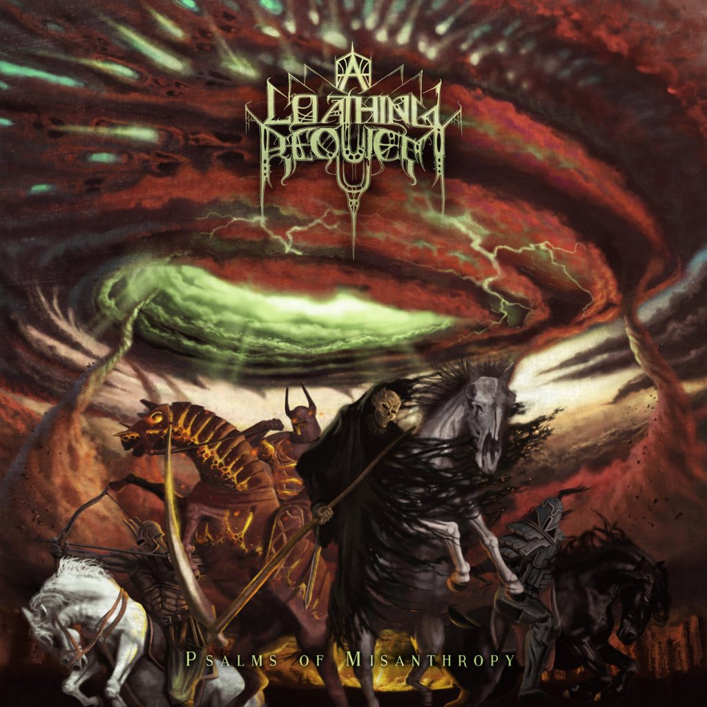
And how about their music…is it as misanthropic as the font?
Yeah, pretty much.
Black metal music itself being one thing, I must once again assert that black metal band logos are illegible and impossible to make out. If you show up at a black metal show, good luck figuring out who's on the bill, unless you're a real fan of the genre. If your gothed out girlfriend takes you to a show, best to just go with it, and try not to act like you're not a fan.
Speaking of fans, these logos are really more like tests of your fandom. Can't read the logo? Must not be a true fan. Read it or die trying. Can't read it. We said die, already! DIEEEEEE!
Filii Nigrantium Infernalium Logo - Link
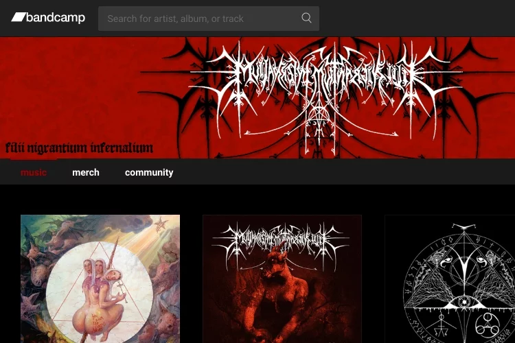
Take the following logo belonging to this extreme metal band, called Filii Nigrantium Infernalium, who are from Portugal.
They are known for such happy go lucky albums as…oh.
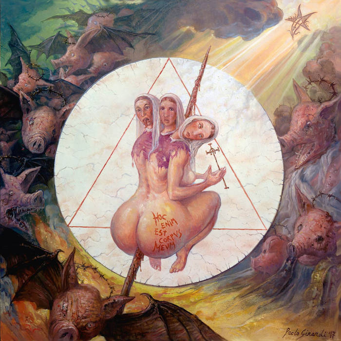
Well that's not nice, is it?
You have to admit, unless you already know the band, you probably wouldn't be able decipher much of that logo if you saw it on a poster or cd.
You would probably be safe in assuming that the music was some really dark stuff, however. Maybe if you lived in the land of Lord of the Rings, their band logo might be the sign you'd see as you walked into an orc village, just before you were savagely gang-banged by a pack of Uruk Hai.
In case you haven't heard of the band Filii Nigrantium Infernalium, here's what they sound like, with their song "Cadafalso".
Your average non-goat head worshipping person might wonder, why do these black metal artists deliberately make these black metal logos so hard to read?
Are they just trying to one-up each other to see who can make the most insane logo possible to go along with the most insane music possible?
That's not really a bad guess, I think, since a lot of this type of music often focuses on death, destruction, and quite frequently even the annihilation of the human race itself.
Prosanctus Inferi Logo
Don't believe us, just ask Prosanctus Inferi (logo below)what they think of the human race.
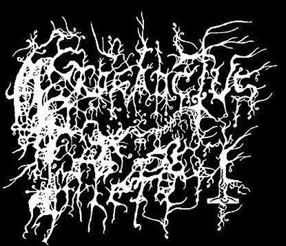
The above logo, we must say, gets about a 3.1 out of 10 on the legibility scale, but perhaps a 10 out of 10 on the evil-looking band logo scale, with bonus points for the fact that it appears that someone may have actually hand-drawn it.
Part of the illegibility may stem from the fact that even if you can make out the words, what the words mean is another thing entirely. In my poor brain, neither "prosanctus" or "inferi" actually bring anything to mind except perhaps the feeling of demonic possession.
Although this logo seems to look more like it has the black plague, rather than the blades and thorns type of logo.
I was interested in knowing more about the Prosanctus Inferi logo, so logically it made sense just to say those two words repeatedly like 50 x in the hopes that I could commune with the band. Luckily, a vortex appeared near to my person, and it was actually one of the guys in the band, asking me what the hell I wanted.
It looked kinda like this…
Upon asking about the band logo, the voice / band member said: "When I drew it (the logo), I wanted it to convey the feeling of the band / music more so than be legible. Our music is a mess, so I wanted the logo to be similar. I also wanted parts of the logo to actually be legible, so if you look at it, you can actually make out some letters."
As I was about to say thanks, the vortex slammed closed with a mighty sonic boom, partially blinding and deafening me for 2 days.
Once I got my hearing back I checked out their song "Red Streams Of Flesh"…
To those who are just getting acquainted with the genre, you'd think there certainly must be a correlation between using illegible spiky white text on a black background with having extremely evil-to-the-core music.
So, is it the more indecipherable the text, the more fucked up the band? It could be, it could be…
Forgotten Land Ambient Black Metal Logo
Take a look at the logo of this next band, called Forgotten Land…

Once again, it is truly difficult to make out the name of this band just by looking at the logo here. The word "Land" seems somewhat legible, but honestly, it is not easy to read any of it.
Artistically, there is something going on here with trees and long, twisted roots, and …hey, there's even a moon in there!
But just because a band logo is pretty much impossible to read, that doesn't mean the music necessarily is going to be impossible to listen to. What kind of demonic music are we about to hear with Forgotten Land? Let's see. Ooooh, Gollum's Cave!
Yes, that certainly sounds like what it might be like in Gollum's cave.
Oh, and I also managed to track down the guy who is the sole artistic force behind the band. Did not get his name, but tracked him down one night in the forest by my house, oddly enough. He was trying to climb back in his hellhole when I grabbed his ragged pantleg and he jumped up before me. This is the photo I took of him.
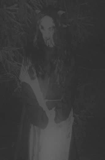
This he told me this:
"Forgotten Land was heavily inspired by nature. I felt the need to update the original logo as it had more of a fantasy vibe, and at the time I was trying to go a bit darker with the songwriting style. So I wanted a logo to reflect that. Not many bands at the time were doing the ridiculous illegible logos and I really wanted it to be very "out there" in that respect. The trees reflected my love for nature in the music, and the logo just sort of went from there."
Forgotten Land is part of the Dungeons Deep record label.

Sometimes, curiously, the band's illegible logo, which has fully infected the band's logo, somehow doesn't affect the album title, which is the case with Black Abyss's album, Funeral Christ.
It's interesting that the album title can still be legible. What is going on? Does this mean the band is less evil, if it's the album name is not illegible scrawls? Let's see… (goes and listens to it) (comes back) Nope. Still sounds pretty wretched!
I decided to use a ouija board to see if I could call up Black Abyss and get their take on their logo. I lit some candles, drank some ram's blood from a saucer, and sat there. Soon enough, the ouija board arrow thingy began to move. This is, verbatim, what it spelled out:
"logo crafted by the band member himself. Logo shows the number of 666, pentagram and hands of evil to relate with the BLACK ABYSS. BLACK ABYSS means Hell..none other" … silence. Then the entity signed off, "Impaler Goat-winged".
"Cool, seeya", I messaged back, and then the ouija board burst into flame and turned to ash in seconds. "Well", my girlfriend, naked and smeared with various oils and wearing a hawk's head as a hat, said "that was freaky!"
Deadly Remains Logo - Link
Next, we spoke to a band morbidly named Deadly Remains, which has a cool, semi-readable logo for something called Severing Humanity.
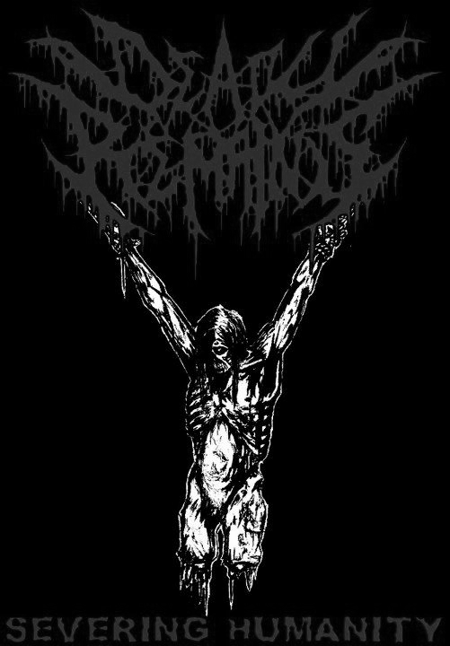
I'm always a bit leery in approaching these bands, as I never know what kind of demonic message I'll be getting in return. A curse, perhaps, put upon me? Ah, well, turns out the guy was pretty coherent, although Deadly Remains is not currently playing shows. He reports on the logo and the band:
"The band started in 2006 as a thrash metal band, and turned into a brutal death metal band over time. We have no ties with black metal bands, but when we changed our sound to brutal death metal, we wanted a new logo, and our friend Steve Crow from the band Condemned drew us a new one. We didn't ask for anything specific and that's just what he came up with. To be honest if you know what the bands name is - Deadly Remains - it's pretty easy to read."
Fair enough, but it isn't *that* illegible. I doubt my mom could read it. Apparently the band is going to make a comeback sometime with an even more illegible logo. Thank God! I mean, Thank you Satan!
Waking The Cadave Logo

Here is another band called Waking The Cadaver, which is a band out of New Jersey that describes their own music as "Slamming Gore Groove". Sounds like a Gwar album title, to me. I thought Gwar had the rights to all "gore" in music, but I guess not.
Also, this band name makes me think jeez, I wasn't even considering waking any cadavers today, but now it's sounding like if I do, I better be ready for trouble.
Anyway, this logo is almost legible, but not quite. At least you can tell it's letters, in this case. Definitely cool looking, and definitely a good use of thorny spikes. In fact, it's spikier than the above picture, so I guess its getting spikier over time? Not sure which if it's thornier or less thorny now or before…or what??!

Here is a sampling of Wake The Cadaver's music, with a song called "Life Lesson". Friendly!
Honestly, I could share illegible black metal band logos with you folks all day. There are black death metal bands numbering in the thousands now, whereas 20 years ago there may have been, like, 3 or 4.
And you know what that means. It just means that we're getting ever closer to that day when humanity sees its final defeat at the hands of demon hoards.
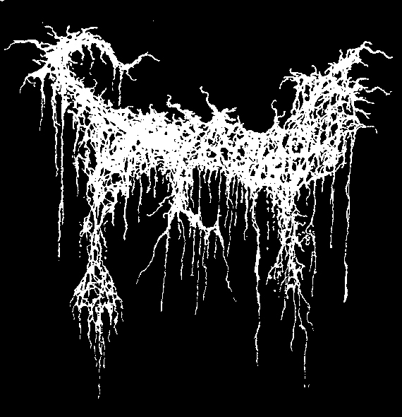
Nucular War Now Logo
Some will resist, while others will welcome the humanity's final days. And with that, we'll leave you with one more logo for you to ponder, and we won't even tell you who it is. 🙂
Also, check this out…it's the all the black metal bands you want and need that are on Spotify now, featuring some of the artists in this article
Conclusion for Best Illegible Black Metal Band Logos
The logos featured in this article are all great examples of how to make a black metal band logo that is both illegible and memorable. By incorporating strange fonts, obscure symbols, and lots of detail, these bands have created logos that are not only dark and moody but also unique and easy to remember. If you're looking to create a black metal logo of your own, be sure to take inspiration from some of the best examples we've showcased here. Do you have a favorite black metal logo? Let us know in the comments!
 |
 |
 |
 |

About Dave Fox
Recorder of many songs, haver of many albums. Dave (AKA Young Coconut) has been making music for the past twenty years or so, of varying genres and degrees of quality, to the dismay of listeners and algorithms everywhere. He’s also in the Suburban Bicycle Gang with Jerry Grey.
Dave has a keen interest in studying all aspects of music history, especially experimental / genres like jazz, krautrock, drum n’ bass, and no wave.
Here’s his Spotify: https://open.spotify.com/artist/1v3iPVEXzurahTI2Tm4Tpm
Leave a Reply
Musical Inspiration
Check for FREE Gifts. Or latest free acoustic guitars from our shop.
Remove Ad block to reveal all the rewards. Once done, hit a button below
 |
 |
 |
 |